Marek Polewski

“The artistic sensibilities of the Berliner Philharmoniker are unique” – an interview with Art Director Marek Polewski

Marek Polewski has been working as a freelance Art Director for Berliner Philharmoniker Recordings for 10 years. Together with the label’s team and visual artists, he develops the visual and tactile concept of the editions. This results in unique products with individual character, whose packaging and presentation is always a small work of art in itself. In this conversation he provides insight into the questions and processes of his fascinating work.

What constitutes the core of your work for you?

For me, it’s important to have access to the music – through a biography, a story, or a specific theme. In the creative field, as in the world of music, there are themes that keep recurring – big, essential themes. These are the aspects I find exciting. And if there’s a small connection that particularly interests me, then I try to develop an idea or a story from it. That’s ultimately what my work consists of: telling stories. When listening to music, you also go on a journey – there’s a kind of storytelling.


How do you develop a concept for an edition?

Normally, I receive a few keywords from the label’s team. Then I listen to the music. Despite more than 10 years of intensive engagement with classical music, I’m not an expert. I read a biography of the composer and I try to figure out what themes the music addresses. What moved Shostakovich, for example? What significance did composing have for him? What happened in his life? What were the external circumstances and what artistic expression did they find? There I always discover a story that particularly appeals to me – perhaps even one with themes that concern me personally.


Do you then go directly into conversation with the visual artists?

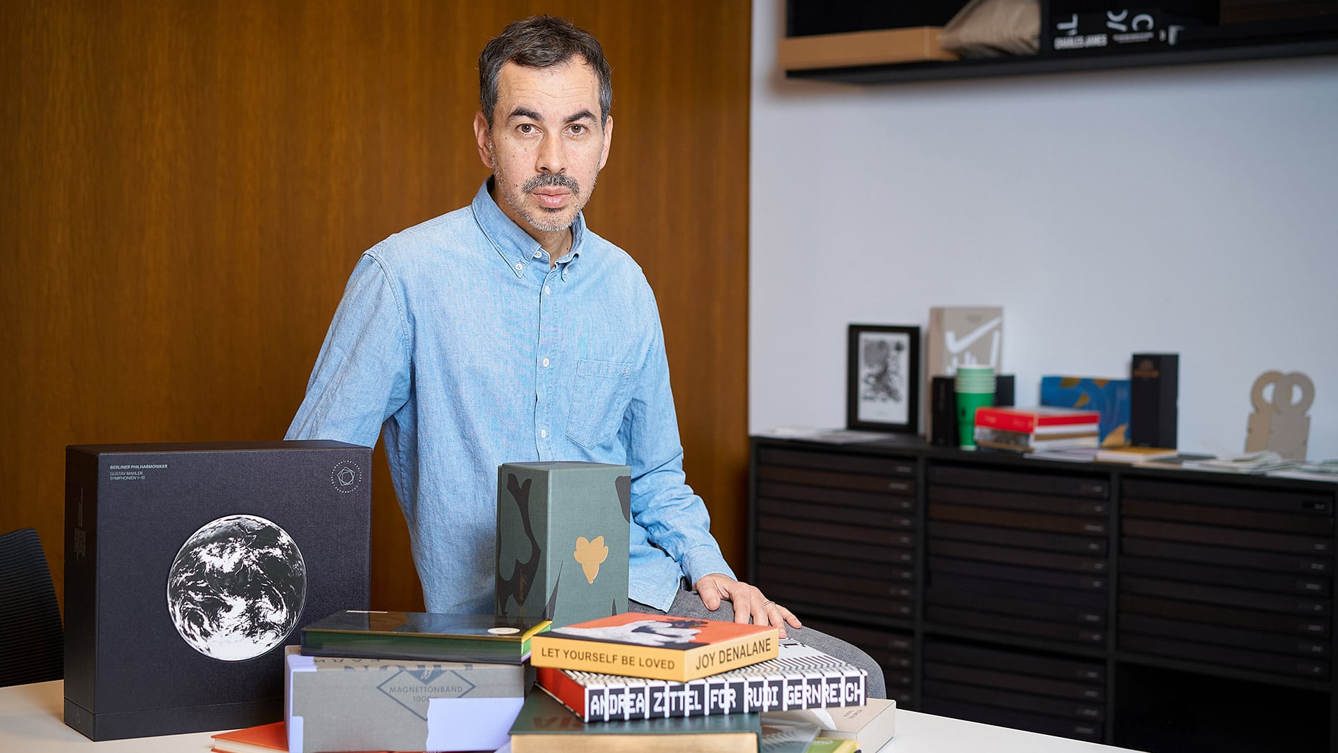
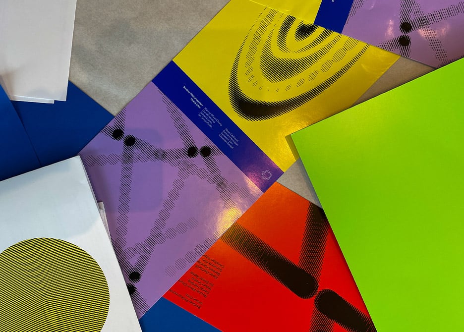
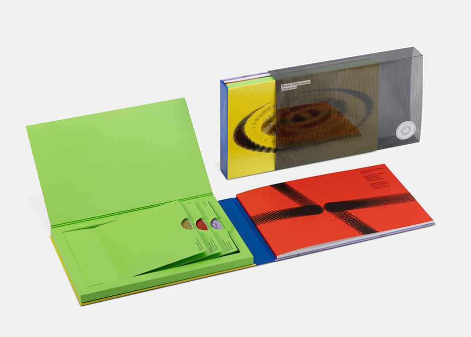
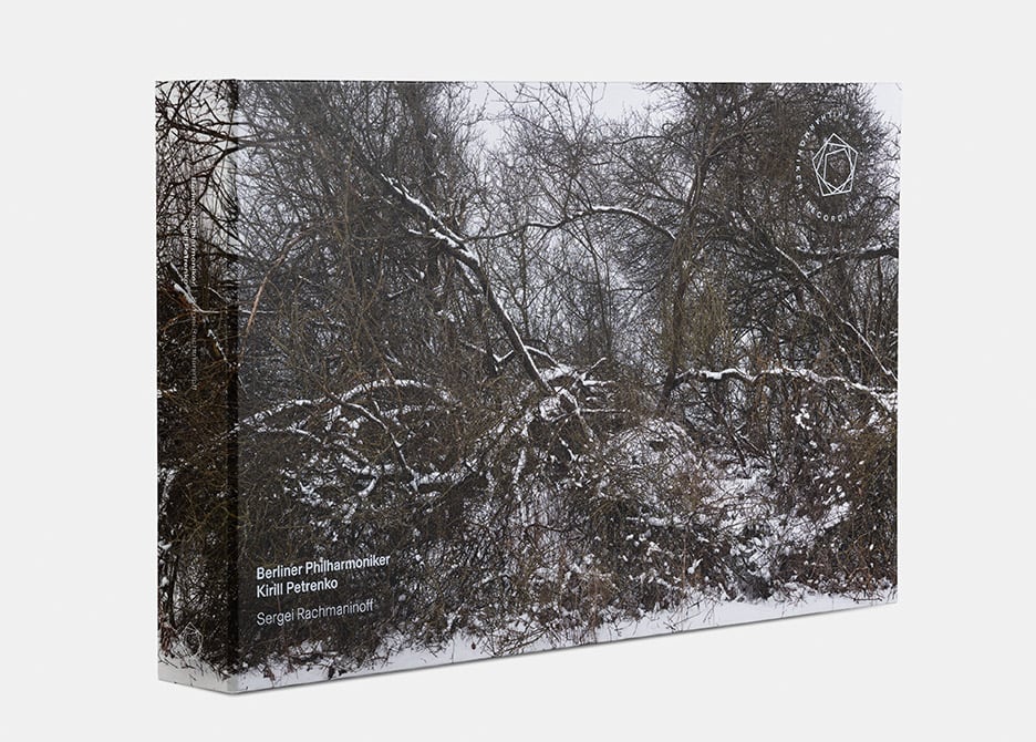
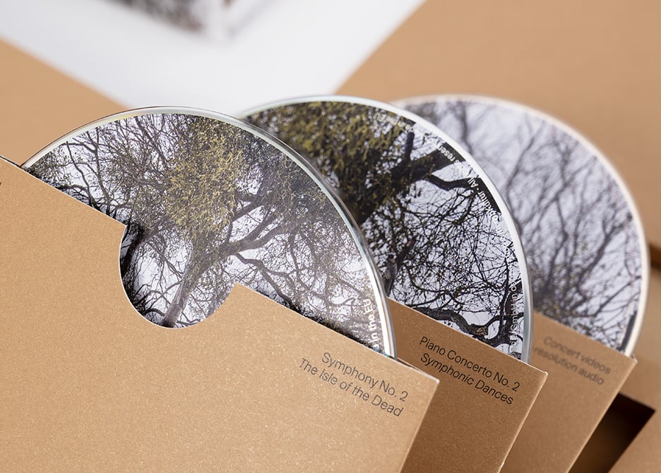
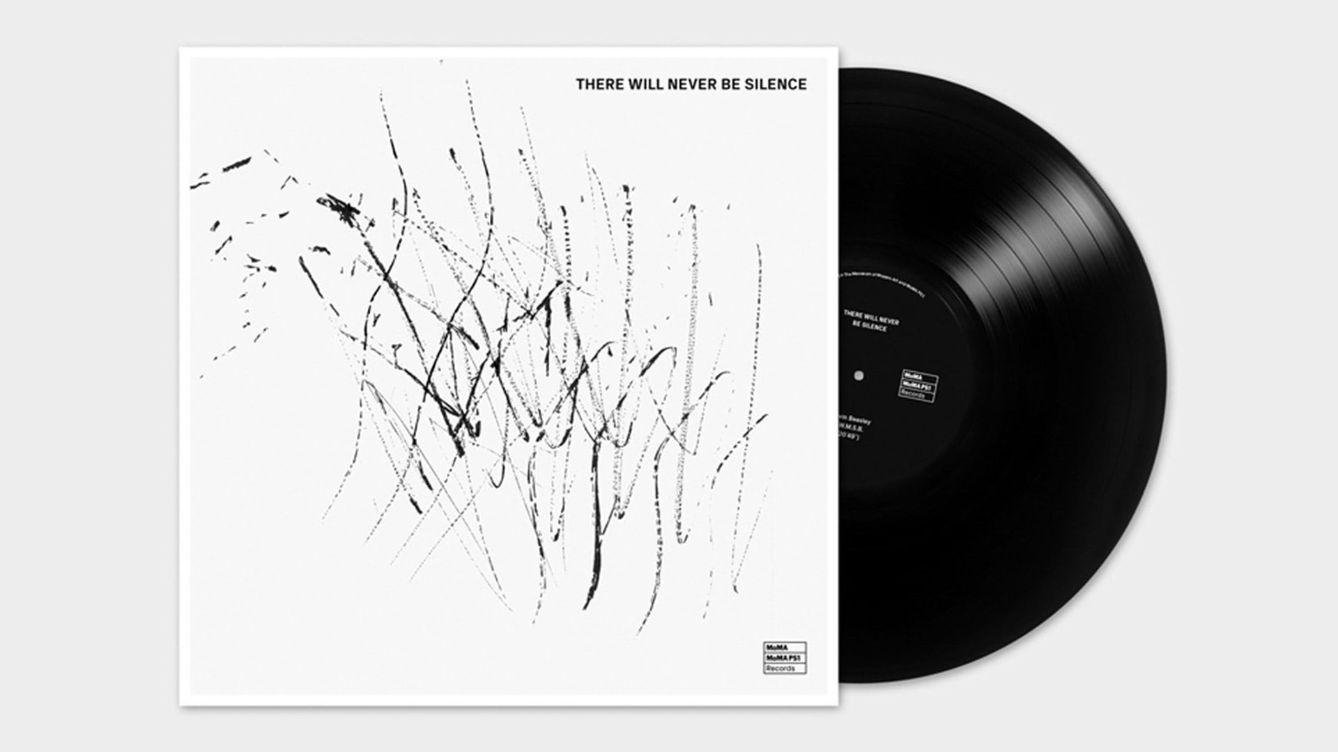
Yes, exactly. The editions of Berliner Philharmoniker Recordings are of such high quality because they are created in collaboration with renowned artists. I find this exacting standard very appealing. If nowadays you physically release print products or CDs, you should also take the step to turn them into small works of art. I find conventional plastic CDs, for example, completely uninteresting as products. I’m delighted, of course, that the Philharmoniker have such a feel for this quality of craftmanship. The packaging of their editions alone are small works of art in themselves. The collaboration with the artists is very exciting: with some, there are longer conversations in which I share my vision, and the story behind the music that appealed to me – and why I think he or she is exactly right for this project.

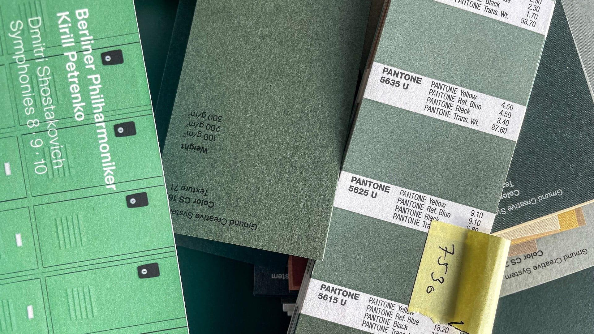
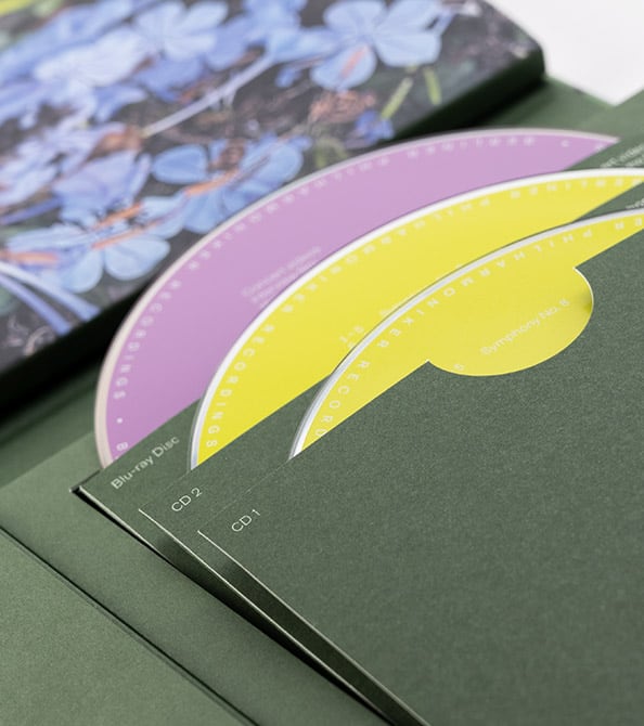
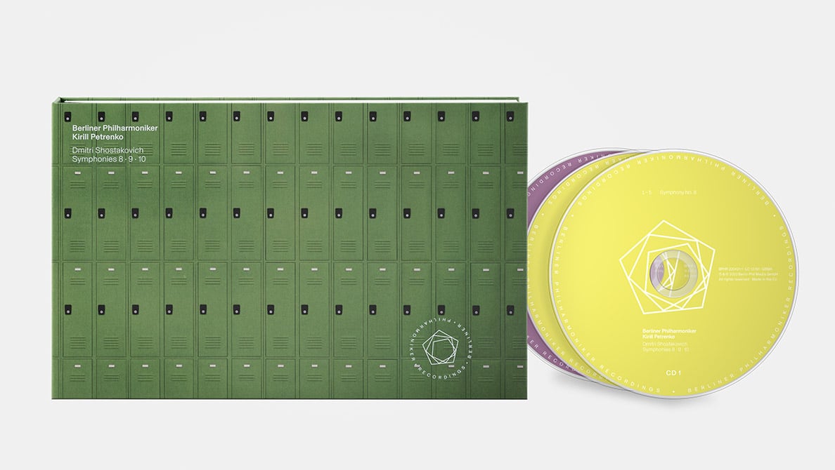
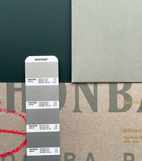
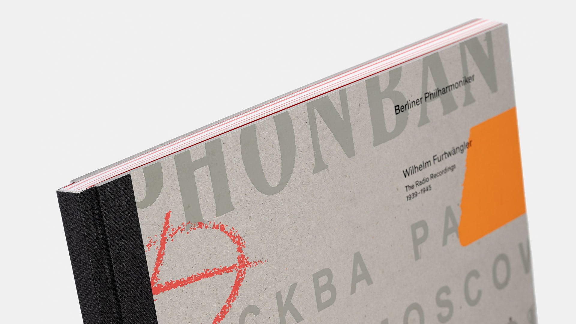
With Thomas Demand (Kirill Petrenko conducts Shostakovich’s Symphonies 8–10), we focused particularly on the symbolism of his images. Ultimately, we decided on the photograph of the lockers, an earlier work of his. The green of the cover harks back to a shade I often encountered in stairwells and balconies in Moscow. For us, the lockers represent an appropriate metaphor for being imprisoned in the communist regime. As a composer with innovative ideas, Shostakovich constantly ran the risk of being branded an enemy of the state in the Soviet Union under Stalin. The system demanded uniformity; the typical prefabricated building architecture from that time is a symbol of curtailing individual expression and forcing people into a grid. Demand’s photo Lockers reflects this aspect and has a threatening aura: associations of locker explosives or secrets that could be hidden behind these doors begin to emerge. When opening the CD edition, a flower motif by Demand is revealed, which perhaps represents Shostakovich’s inner world, forming a contrast to the cover.

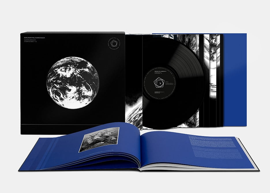
The concept for an edition sometimes emerges with more, sometimes with less, input from me. For the Mahler edition, for example, I didn’t actually suggest options; I simply said: We need this one particular drawing by Robert Longo. For me, that was simply the Mahler image. I requested it from him, and it worked wonderfully. With Jorinde Voigt (The Berlin Philharmoniker and Frank Peter Zimmermann), on the other hand, I told her which of her pictures were my favorites. Then together we selected one that matched the music, chose colours, and looked at how everything harmonized. Such a collaborative selection is always really rewarding, as I learn a lot in the process.


“What I create shouldn’t look like graphic design.”

The result is, in each case, always more than a simple CD box.

What I create shouldn’t look like graphic design. Such a design would inevitably have something seasonal about it, an aesthetic that follows a certain trend. It can then be assigned to a year or a time period in which it was considered modern. I try to develop products that still function as art objects after 10, 20 years. Art is timeless – it can exist as such over centuries.


How do you avoid not falling into repetition?

It is my aspiration that each edition receives its own character. It shouldn’t be a serial production. The form is serial, but the artwork should not look serial. Of course, there are still elements which remain constant; the font and the logo with their ‘recognition’ value lie like a template over the designed cover. Everything else must be free and may be reinterpreted. Yet the questions are always similar: what are the central themes and how can they be transferred into a visual and tactile form?


“Through haptic elements, the products acquire something sculptural.”

How does the haptic concept come about?

Sometimes the haptic quality of the boxes develops in collaboration with the artists, sometimes without them. Some are glad when we take care of it, some enjoy being involved here too. Through haptic qualities, the products acquire something sculptural. They become small art objects, and that’s where touch is very important. Paper is an amazingly beautiful medium.


What is decisive for you when selecting the paper?

With Thomas Struth (Kirill Petrenko conducts Sergei Rachmaninoff), we selected a relatively transparent paper to evoke a feeling of simultaneity. As he himself described it: the photograph he selected with the snowy landscape is like a composition of a thousand instruments and sounds. In the same way as it does in the orchestra, an interplay also emerges here within the image – through the twigs, branches, trees, and shrubs. And so the idea came to me to use a transparent paper where the next page and the next page after that always shine through. These pages also feel great. Another aspect is the sound of the paper. Certain pages produce a different sound when turning than others. With Jorinde Voigt, we used this idea of working with very thin paper for the first time, the type often used in Bibles – also a kind of quote. This way, the CD box becomes a complete composition.


How did the concept for the Ozawa edition come about?

For the homage to Ozawa, we didn’t collaborate with an artist. We studied photos of him, and I had long dreamed of working with a certain, very special kind of Japanese paper. Here, finally, an opportunity presented itself. In Japan, people have a different approach to paper. In Europe, the rule often is: the thicker, the better. In Japan, however: the thinner the paper, the finer, the higher quality. During our research we came across a photo of Ozawa wearing a white linen suit, and I had selected this slightly transparent paper with a white woven structure worked into it, which has something very musical and lively about it. White stands for mourning in Japan. Since red was Ozawa’s favorite color, we decided on it for the typography. The gray cardboard underneath is also recognizable. So you can see the core of the structure, which is normally not visible in hardcover books.


“You complete the artwork.”

What was the idea behind the removable photos in the Ozawa edition?

It’s not a mass-produced box, but an interactive booklet with inserted photos that fall out. This gives the impression of getting a particularly intimate insight. A bit like leaves that you press between book pages. Or photos, memories that you collect. Interactivity is a nice aspect, which was also at the forefront of the Unsuk Chin edition. You can pull the edition out of the packaging, and through the optical phenomenon of the moiré effect, a new, dynamic pattern emerges: “You complete the artwork” – you buy the edition and don’t simply enjoy its content, but can even partly help shape it yourself.


How did you come to Berliner Philharmoniker Recordings?

I was working on a project for Deutsche Grammophon with Felix Mesenburg at the time. Then I completed a project for the Museum of Modern Art in New York. Shortly thereafter, Felix Feustel came to my office and told me the Berlin Philharmoniker were looking for someone for artwork – Felix Mesenburg had recommended me. And then I showed Felix Feustel my work, including the MoMA project. That project was also a kind of record cover. He and Olaf Maninger liked it. My initial work for Berliner Philharmoniker Recordings was actually just to deliver cover ideas. The first edition I worked on was the Schubert box with the colorful trees, a photo by David Benjamin Sherry, whom I had long admired. I generally begin researching which covers already exist for other recordings of the music. I find it beautiful when conceptually logical ideas are implemented freshly and modernly, and in doing so, break away from the familiar visual marketing aesthetic of classical music – not producing work for a presumed older audience, but instead asking: What do I find appealing? With Schubert, these forest shots emerged from his connection to nature. So I designed the first cover, a second, a third – and then I suggested continuing the artwork inside the edition as well, so that the aesthetic runs through the entire product. I’ve enjoyed the trust of the label for 10 years now, and that makes me very happy.


Cover of There Will Never be Silence, LP edition released by MoMA/MoMA PS1 Record label


“Working for Berliner Philharmoniker Recordings is a dream job.”

Which project for Berliner Philharmoniker Recordings was particularly close to your heart?

I believe the Shostakovich edition, because it is so multifaceted. I was born in Moscow, so I could personally delve deeply into this story and also talk to my parents about that time. The box is radical, I think, conceptually strong and consistent – I’m really proud of it. I also like the Mahler vinyl edition because it is so monumental. The cover touches me. This image evokes memories of the Corona pandemic in me, as we worked on the project during this global crisis. For me, Mahler’s music stands for the human condition – the simultaneity of life and death, joy and suffering, love and loneliness, hope and despair. No image represents this state better for me than Blue Marble – a photo that American astronauts took of Earth. Robert Longo photo-realistically drew this photo in 2012, and it was clear to me that this work had to be the cover for the Mahler edition. There’s this story that one astronaut said to another: “Hey, turn around, look: the Earth.” Their mission was to photograph the moon. And then they were all completely struck by the beauty of their own planet. There is a phenomenon described as the Overview Effect: the sight of Earth from space evokes a feeling of deep awe and connectedness, resulting in an increased sense of responsibility for the environment. And nature was a central subject for Mahler. This box is also wonderfully coherent. In its booklet, you’ll find the moon and stars, and when you arrange the 16 LP covers into a square, a 1.20 m x 1.20 m sun emerges – like on a journey through the galaxy, along with this beautiful blue, which is a kind of Yves Klein blue.


If you were given free reign to choose a project from anything you liked in the music field, what would it be?

I must say, working for Berliner Philharmoniker Recordings is a dream job. I studied art and have worked for many different labels. The openness to this form of collaboration that this label extends to me, the understanding of art here – all of this is unique.